For Ice Cream!
Read an article today about how Houston's fave artery-clogging, mixin-lovin' ice cream shop, Marble Slab, is rebranding itself. Courtesy of MarketingDaily:
"This spring, the chain, which has more than 390 locations in 35 states, Canada, Mexico, Lebanon, Bahrain, Kuwait, Oman and the U.A.E., will roll out redesigned packaging on all containers and point-of-purchase materials. The new containers will highlight the tagline "Find Happiness Within" and move from plastic to paper to be more environmentally friendly. "
Other rebranding initiatives include a new website that will appear more "high-end" as well as new store designs in a pink and brown palette.
Interesting. Marble Slab has always been the ugly stepsibling to other ice cream shops (think Cold Stone and the new tart places that seem to be popping up everywhere). The new brand is supposed to change this by connecting customers with the "gourmet" ice cream experience they're looking for. I don't know if I buy the whole gourmet ice cream thing, but hey, my fave ice cream is a Wendy's frosty, so I don't exactly have refined taste.
It will certainly be interesting to see what happens. Admittedly, my eyebrows do raise (just a little) about an ice cream shop trying to appear more high end in this economic climate. Given the slowing sales at Starbucks and the (relative) stability of it's blue collar competitor, Dunkin' Donuts, going high end seems like a suicide wish. I guess only time -- or a couple banana splits -- will tell.
Friday, April 24, 2009
Friday, April 17, 2009
REALLY bad product placement
I'm not a big 90210 fan. (I really only watch it when I want to avoid going through my bills.) But I watched an episode the other day and OMIGOD ...MUST.BLOG.ABOUT.IT.
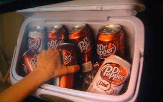
Some of you saw my facebook status a couple days ago about the show, so you know that I wasn't interested in (insert sarcasm here) the riveting storyline or award-quality acting. No, what shocked (and disgusted) me about the most recent episode was the ridiculous Dr. Pepper product placement. In fact, the LA Times compares it to a "'Saturday Night Live' spoof of a television show doing product placement." Yikes.
Check out these stills from the show (courtesy of NY Mag). Keep in mind that this is only a FRACTION of the Dr. Pepper placements in the show....I seriously thought that at one point Dixon would just turn into a can of the freaking drink. It was that bad.


(I especially love the second image 'cause when I road trip, I always make sure to pack my cooler with Dr. Pepper cans...and the logo is always showing. I guess I'm just cool like that.)
With the invention of Ti-Vo, I understand that companies are having to come up with new ways to get their brands in front of consumers. (Cause with the exception of Ad Geeks like myself, who watches commercials???) And to be honest, I think product placement can be a good way to reach these customers. But the key is to make sure it's not too blatant or inauthentic. I'm not stupid. I know when you're selling to me while pretending you're not. And that just pisses me off and makes me put that Dr. Pepper back on the shelf.
Some of you saw my facebook status a couple days ago about the show, so you know that I wasn't interested in (insert sarcasm here) the riveting storyline or award-quality acting. No, what shocked (and disgusted) me about the most recent episode was the ridiculous Dr. Pepper product placement. In fact, the LA Times compares it to a "'Saturday Night Live' spoof of a television show doing product placement." Yikes.
Check out these stills from the show (courtesy of NY Mag). Keep in mind that this is only a FRACTION of the Dr. Pepper placements in the show....I seriously thought that at one point Dixon would just turn into a can of the freaking drink. It was that bad.


(I especially love the second image 'cause when I road trip, I always make sure to pack my cooler with Dr. Pepper cans...and the logo is always showing. I guess I'm just cool like that.)
With the invention of Ti-Vo, I understand that companies are having to come up with new ways to get their brands in front of consumers. (Cause with the exception of Ad Geeks like myself, who watches commercials???) And to be honest, I think product placement can be a good way to reach these customers. But the key is to make sure it's not too blatant or inauthentic. I'm not stupid. I know when you're selling to me while pretending you're not. And that just pisses me off and makes me put that Dr. Pepper back on the shelf.
Saturday, April 11, 2009
When your marketing firm has bad ads
Hi all,
In Austin this weekend with the lovely Ms. Carolyn Goodwin. So far, it's been a perfect weekend --- too much food, too much wine, and too much sleep. Perfect.
At one part during the weekend, Carolyn's mom showed us an ad for a marketing firm in The Woodlands. "Have you heard of them?" Neither Carolyn nor I were familiar with the company (who shall remain nameless) but within 5 seconds we were both grimacing. Why? The ad, for said marketing firm, was awful.
I always find it humorous when marketing or advertising companies boast generic logos, advertisements created in word, or (worst of all) websites reminiscent of 1999. Yikes. What are these companies thinking? Sure, the average person isn't going to know great design from good design, but bad design? Sorry to break it to you -- they know. And the worst part? An advertising company with bad marketing materials is like a surgeon marketing a recent malpractice suit, or a home builder publicly admitting that his homes have leaky roofs.
My current company is doing stuff the right way. We're in the process of reworking our website -- admittedly it's overdue -- but in the meantime we've resisted keeping our old, out-dated site up. Although not having a web site is risky, we recognize that having a BAD site up is far worst.
What do you think? Are you equally as repulsed by marketing and advertising companies whose design or writing leaves much to be desired? Or am I just overly critical?
Thursday, April 2, 2009
Jack in the Box
My fave post-bar restaurant is revamping its style.
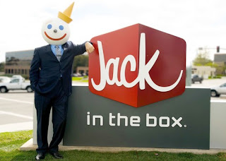
San Diego-based Jack in the Box is undergoing an entire brand makeover. New logo, new store layout and even a new website. Have you seen it? Check out some of the images below.

Thoughts? People seem to be mixed about the whole thing. Some people love it, others hate it. The major consensus is that it doesn't look like a fast food restaurant logo....
I personally dig it. Much better than the old, outdated one. Thoughts?
San Diego-based Jack in the Box is undergoing an entire brand makeover. New logo, new store layout and even a new website. Have you seen it? Check out some of the images below.

Thoughts? People seem to be mixed about the whole thing. Some people love it, others hate it. The major consensus is that it doesn't look like a fast food restaurant logo....
I personally dig it. Much better than the old, outdated one. Thoughts?
As seen on tv....
Did you hear that Billy Mays is getting a television show?
Don't know who Billy is? Trust me, you do. Watch.
I guess this is actually sort of old news. The show launches April 15 on the Discovery Channel and follows Billy (as well as Anthony Sullivan) during the taping of some of their two minute commercials.
Is it just me or is it sad that we now have a TV show about infomercials? Reality TV is getting to be too much....
Subscribe to:
Comments (Atom)
